
Logos are not just images; they are the history and identity of the brand. For Gimkit, the extremely popular game-based learning system, the logo has evolved with the goal of changing the way classrooms are interacted with. From a humble start-up to a modern, minimalist icon, the Gimkit logo is a history of innovation, adaptability, and empowerment in teaching.
Take a closer look at the history of how the Gimkit logo has evolved, why the evolution occurred, and how the brand identity has come out strong through thoughtful design. Whether fan, student, or instructor, the history will surprise and inspire.
The Origins: A Student Project Turned Vision
The Gimkit origin story begins with a high school student, Josh Feinsilber, the founder of the website, whose creation was the product of a class project. The original logo wasn’t sleek, befitting the amateur, grassroots start—plain, no-frills, minimalist. It wasn’t from a professional, yet it was still usable.
The original design even had a standard font with no graphical icon, using pure name recognition. It was rough around the edges, but appropriate for the nascent development stage of the platform. The rough, down-to-earth look made the brand appear real. When Gimkit gained popularity and functionality, the need for a better, bolder visual brand image arose.
First Redesign: Embracing the EdTech Aesthetic
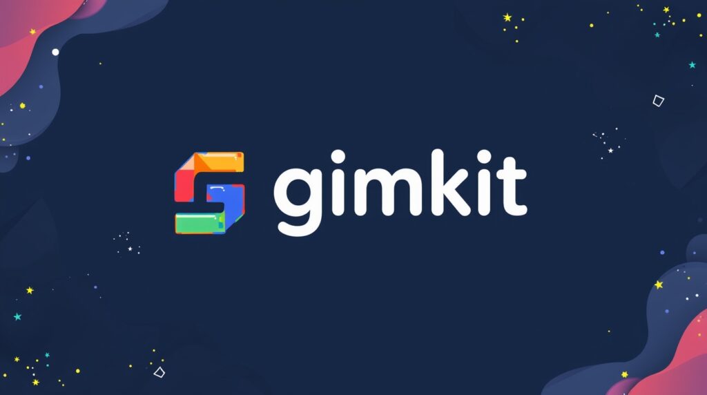
When started with play Gimkit to take hold among teachers, the process of rebranding welcomed a newer, high-tech logo. Their new design built structure and personality into the imagery. The new logo included a bolder, friendlier font with minimal spacing, choosing instead to appear professional yet student-friendly.
Designers made the logo impactful in use on both mobiles and the web, functioning at any scale. Enhancements to the colour palette involved the inclusion of soft blues and greens that reflected the calm, active learning environment Gimkit creates. The new design marked the evolution of the platform from a startup to a serious player in the EdTech world.
Introducing the Icon: A Symbol of Gamified Learning
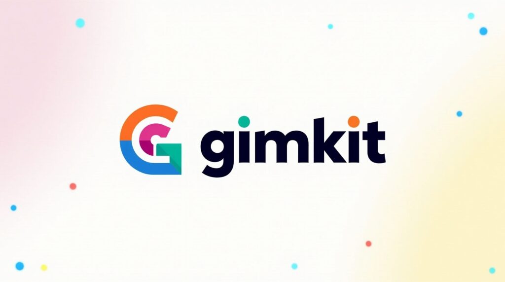
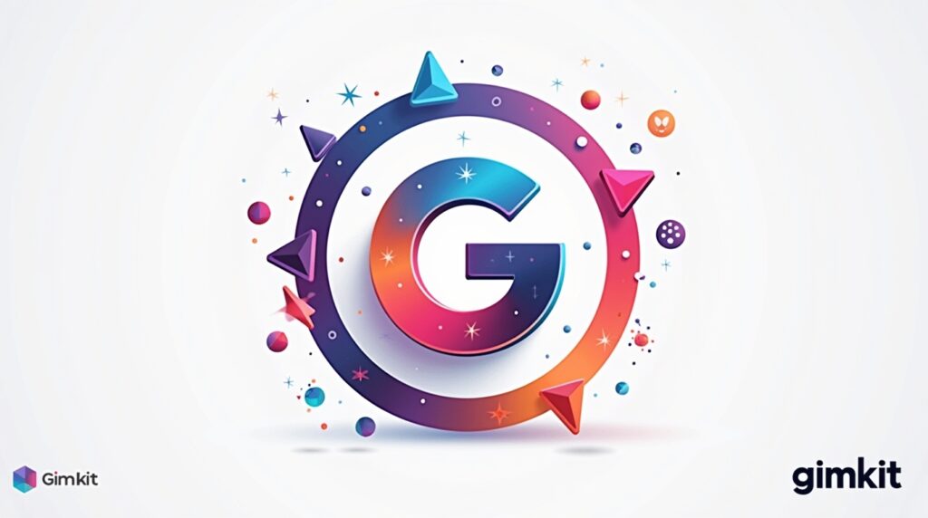
With the growing gamification of the platform, Gimkit incorporated a stand-alone icon in symbolic form. Game changer. A pixelated shape or badge shape stylised “G” began to materialise everywhere in social media personas and app icons. Designed with flexibility in mind: immediately recognisable, minimalist, and adaptable across digital media.
It also mirrored the gaming culture that the students are fond of while being in an academic tone. Hence, it exhibited brand maturity, keeping it simple yet profound. It allowed Gimkit flexibility in employing a symbol without a word, something the giant technology giants do, solidifying brand recognition among all the global users.
Typography Evolution: From Basic to Bold
Typography can greatly affect brand impressions. Earlier versions of the Gimkit logo used simple, sans-serif fonts. But as the platform matured, the font evolved to something geometric and custom. Present-day versions use smooth, rounded letters with even letter spacing, making the name easier to remember.
These changes are reflective of the brand evolving in the direction of a broader, youthful tone. The new font has also been screen-optimised to read clearly on tablets, phones, and interactive whiteboards. Each curve, each angle in the new font has a reason—it’s designed to read as communicating energy, friendliness, and focus. It tells the viewer: this is smart, fun learning.
Colour Psychology: Crafting a Positive Learning Mood
Psychological triggers are colours, and Gim kit takes advantage of that in the perfect manner. The brand colour evolved from grayscale and primary colours to vibrant, relaxing colours. Blues are the epitome of trustworthiness and cleverness—ideal for a learning website. Greens are linked to development and creativity, something that befits the goal of learning daily.
Every now and again, you’ll find accent colours like purple or orange, injecting excitement without taking over the design. These were no afterthought—they complement Gimkit’s emphasis on making learning fun, not pressure.
Colours are also used in achieving consistency in the aesthetic of features like Gimkit Live, Ink, and Creative Mode, making the experience uniform for the user.
Logo in Digital Space: Responsive and Adaptive
In the multi-device era, a logo must be effective at a variety of screen sizes and orientations. Gimkit’s new logo redesign is fully responsive, scaling perfectly from phone app icon to smartboard screen. It isn’t just about reducing scale; things adapt slightly for the proportions to stay even.
The icon can be simplified or restructured to some extent, depending on the use case, functioning well while remaining legible. It adheres to inherent UX/UI design principles, making the brand professional yet user-friendly.
Whether applied in a Google Classroom thumbnail, app menu, or video banner, the Gimkit logo appears clear and brand-standard. It requires that level of adaptability to showcase elite thinking in design.
Influence of User Feedback on Design Decisions
One of the most attractive aspects to join Gimkit game has been the community-driven feedback loop. Its users—largely pupils and teachers—have had a say in how the brand appears. Questionnaires, beta versions, and even discussion forums have all influenced visual decisions.
Adjustments of colour, for example, and icon simplification occurred after teachers bemoaned readability through projectors. Inviting the users to the table has made the brand feel even more inclusive of its original mission: learner empowerment. It is rare to see this sort of input in design modifications, making the development of the logo more intriguing.
What does the Current Logo represent?
Today’s Gimkit logo is a polished, professional symbol of modern learning. It’s not merely a name—it’s a benchmark of experience, flexibility, and creativity. Each element of the design, from its font to icon, emerges from years of evolution, user input, and brand strategy development.
The result straddles familiarity and newness, so long-time users embrace the new design, as well as new users. It’s adaptable enough to morph further if need be, staying future-proof yet remaining true to its core. The new logo is a marker, solidifying Gimkit as an innovator in the future of learning.
Conclusion
Embedded in the evolution of the Gimkit logo is something greater than design updates—it reflects a mirror on the development of the platform, its direction, and its strong identification with its users.
What started out as a side hustle in high school developed into a next-generation learning platform, with every evolution of the logo being a narrative of innovation and direction. With changing needs in education, so will the brand. One thing, however, will always be paramount—its essence, always remaining true to where it all began.
FAQs: Common Questions People Often Ask
1. Who designed the original Gimkit logo?
The original logo was created by Gimkit’s founder, Josh Feinsilber, during the platform’s early development as a school project.
2. Why did Gimkit change its logo?
The logo changed to reflect the platform’s growth, embrace modern design trends, and improve usability across different digital platforms.
3. What does the Gimkit icon represent?
The icon symbolises gamified learning and interactivity, with a stylised “G” that resembles a badge or game element.
4. What colours are used in the current Gimkit logo?
The modern logo uses shades of blue and green, occasionally accented with other vibrant colours to represent trust, growth, and creativity.
5. Can the Gimkit logo be used in school materials?
Yes, if it’s used in an educational, non-commercial context and follows Gimkit’s brand guidelines available on their official site.